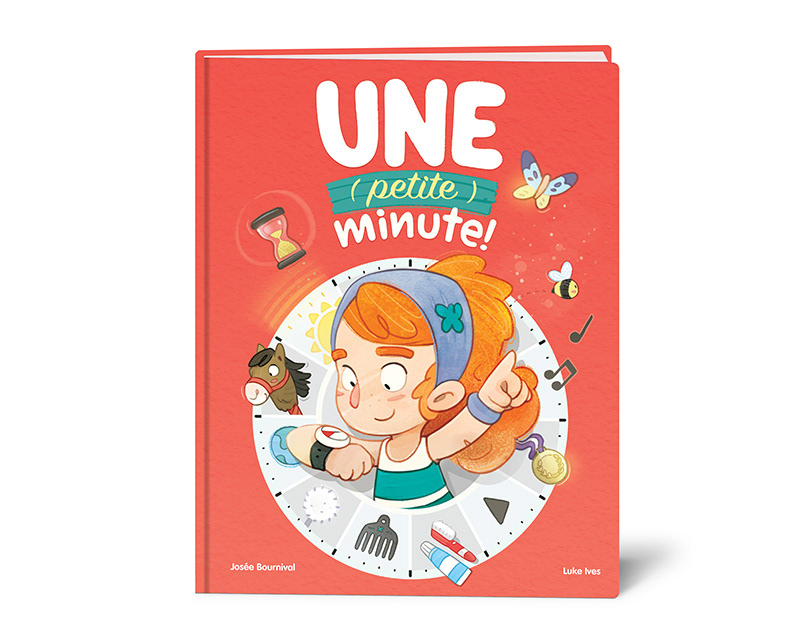
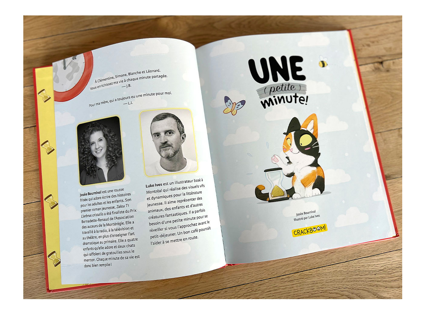
Une (petite) minute!
Publisher: Crackboom! Books
Date of publication: May 2025
Author: Josée Bournival
Illustrated by: Luke Ives
Process
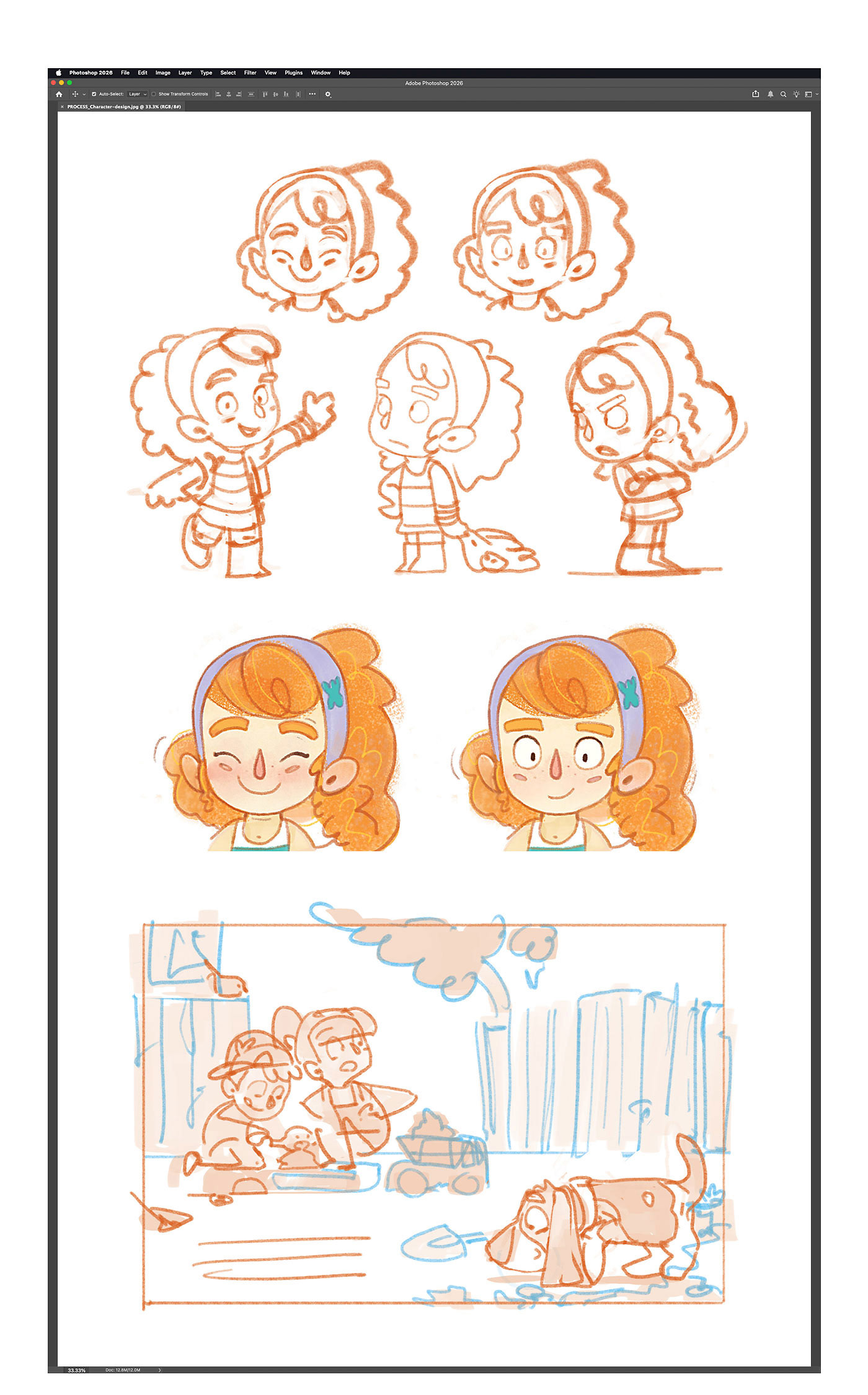
My process usually starts with character development, or a few key pieces of art.
Since the cover character appears throughout the book, I began by quickly exploring her look and personality, then shared my favourite version with my editor. Cleaning up a few loose sketches with tighter lines and a touch of colour helps communicate the idea and sell the concept.
Locking in the character early sets the visual tone for the whole project, giving me a consistent reference point, and helping my editor clearly understand the overall look and feel I’m aiming for.
I also create a few rough scene sketches with simple values to show how I plan to use white space in my compositions. This helps clarify my intentions before I move on to the bulk of the work.
After establishing an art style for the project, the next step is creating the cover illustration.
I usually pitch two or three concepts that feel right and see how the publisher responds.
Often, one idea sticks, and with a bit of refinement, it comes together pretty quickly.
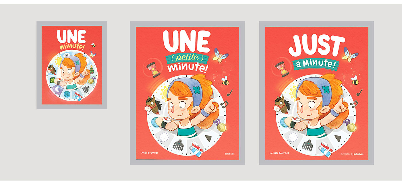
This project’s cover needed more exploration than usual to clearly communicate the theme of time, so I went back to sketching thumbnails and trying out different ideas.
At this stage, I focus on working quickly and exploring as many options as I can. I add notes to help make sense of my scribbles, and occasionally share my own thoughts on what’s working (or not).
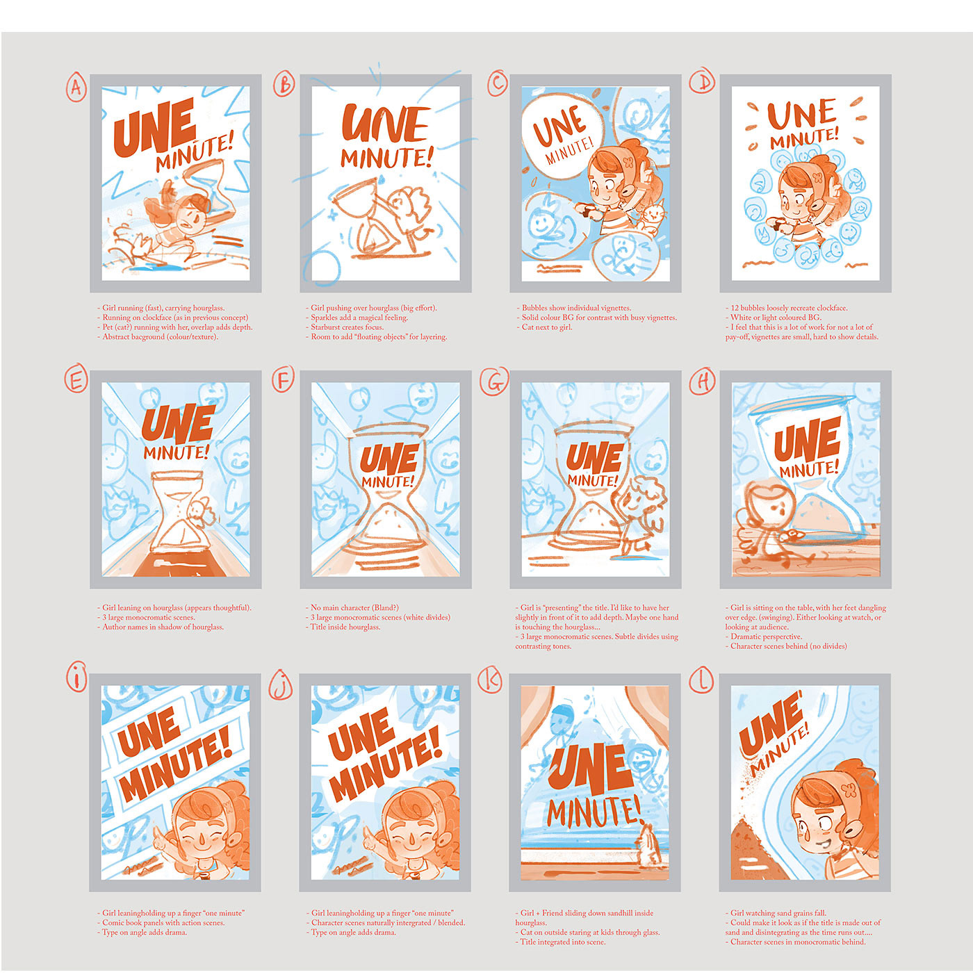
After the client reviews my early sketches, we usually pick a few directions to push further. Ideas often get mixed & matched, and I test different layouts of the same concept to see what works best.
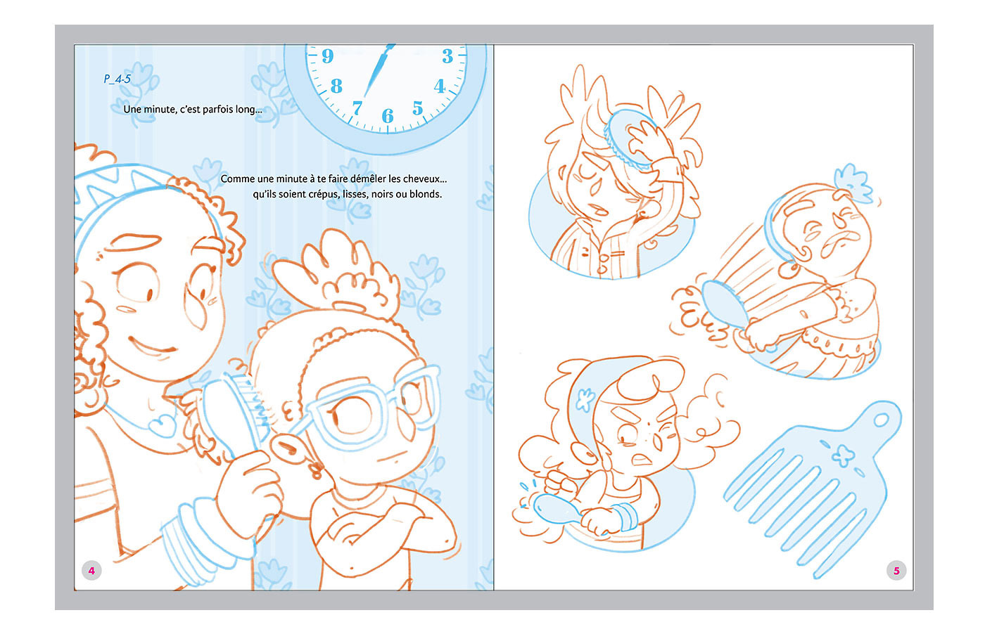
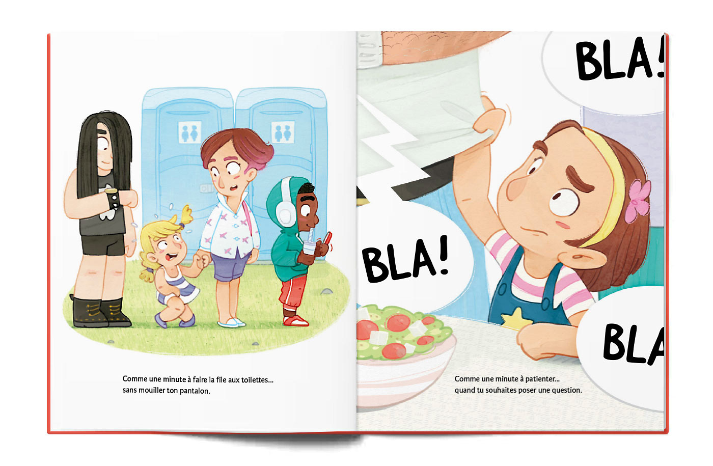
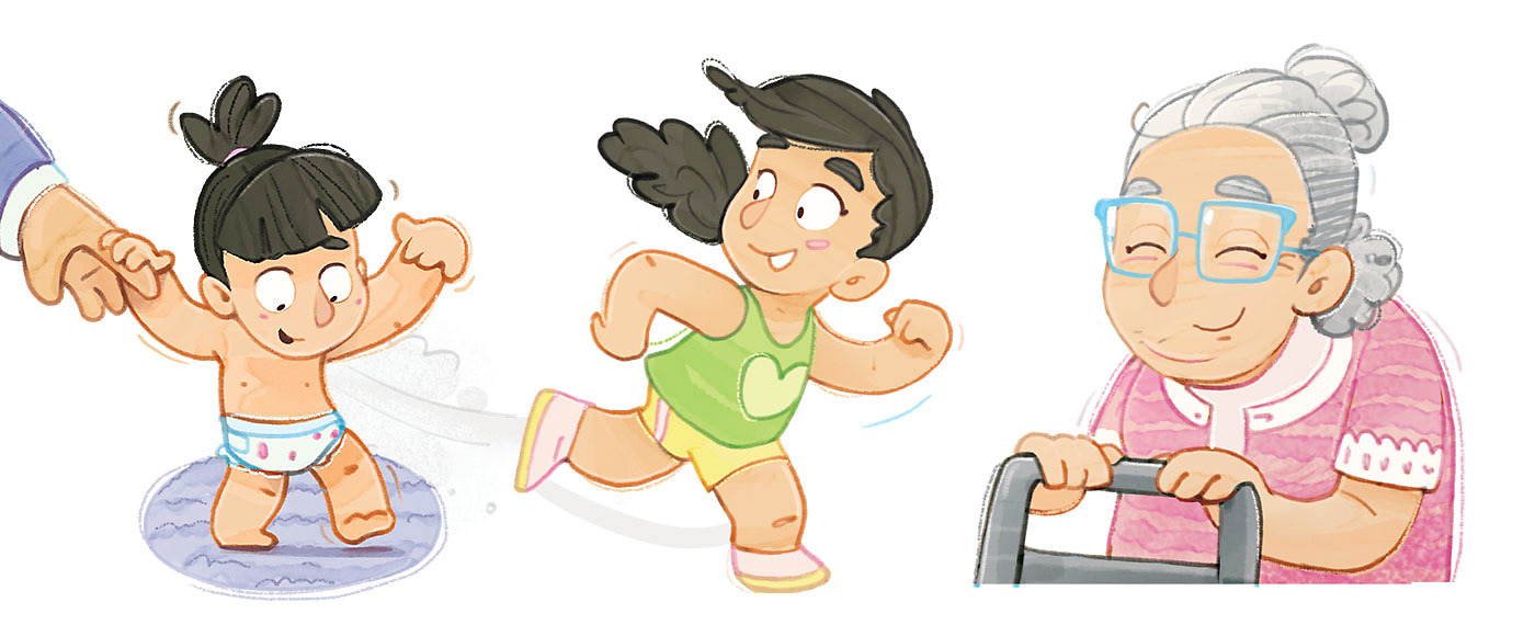
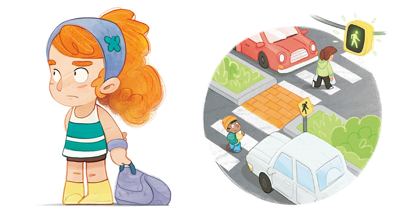
Below, I'm exploring the varying pace of time through a series of action-scene vignettes.
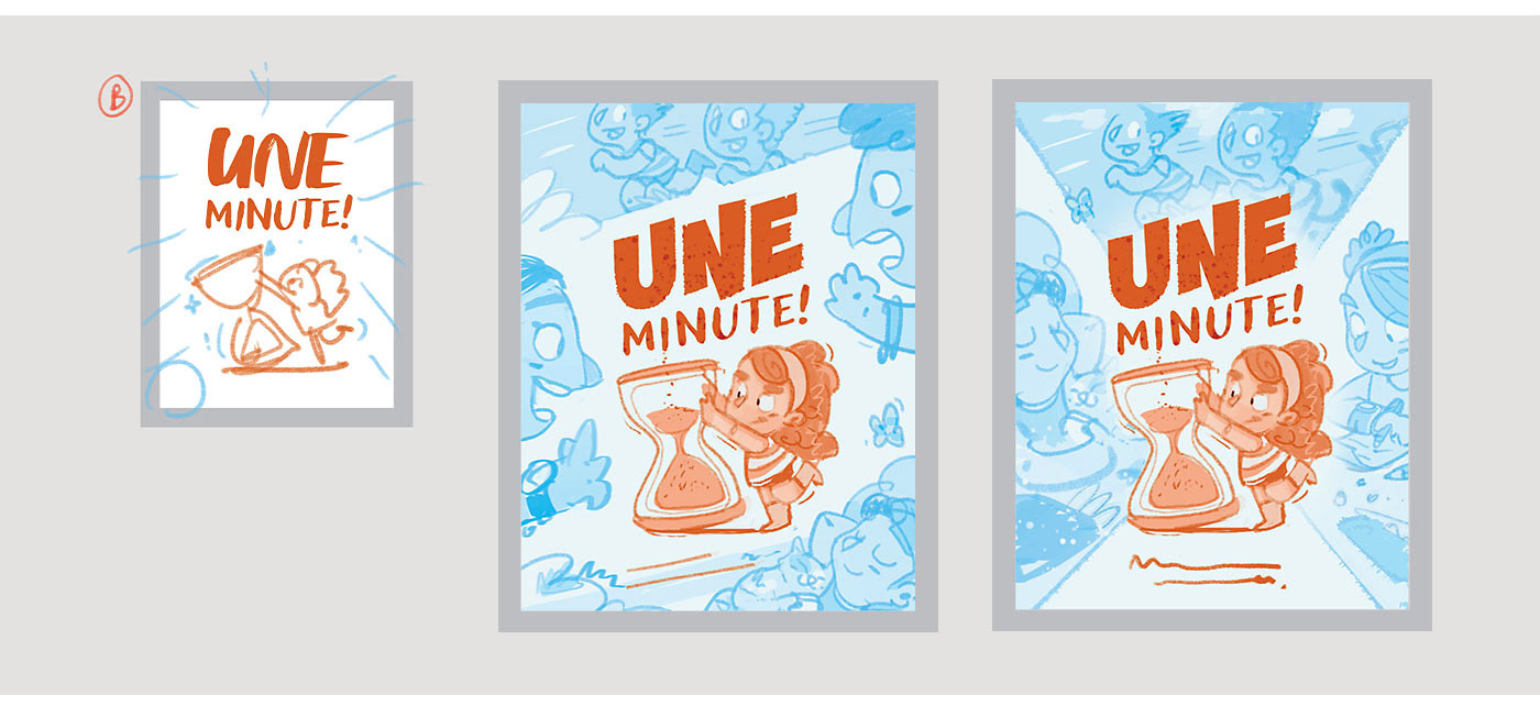
The client ultimately chose Concept (D), but asked for a clearer clock-face and that we use icons to represent time instead of vignettes. In the sequential explorations, I proposed making the icons monochromatic (left) and letting some elements break out of the frame (right).
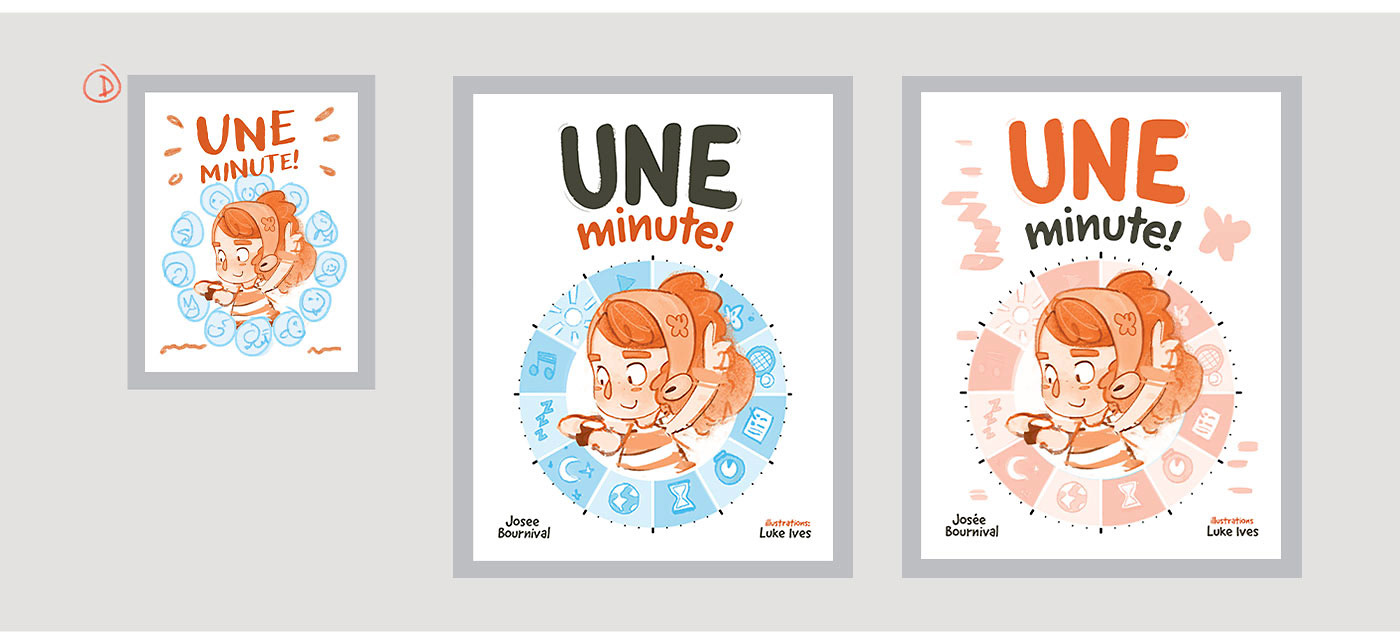
This small image below shows a cover proposition with some colour in the clock-face and earlier versions of the icons. For the final versions (right), we removed that colour and refined the icons so they worked more coherently with the character art. We also increased the size and number of breakout elements.
Despite a late title change for the French edition, the layout was designed to accommodate language changes and minor text adjustments.
For interior spreads, I start with a single document of tiny thumbnails so I can see the whole project at once.
I work on these simultaneously, keeping layouts consistent, adding simple values to show white space, and breaking down the text to match the illustrations I’m planning.
I work on these simultaneously, keeping layouts consistent, adding simple values to show white space, and breaking down the text to match the illustrations I’m planning.
Things are super rough at this stage, perfect for staying flexible and making big changes without sacrificing something I spent time on. I always walk my editor through this “fast-pass” in person, so I can explain my vision and decode the scruffy sketches that probably only I can read!
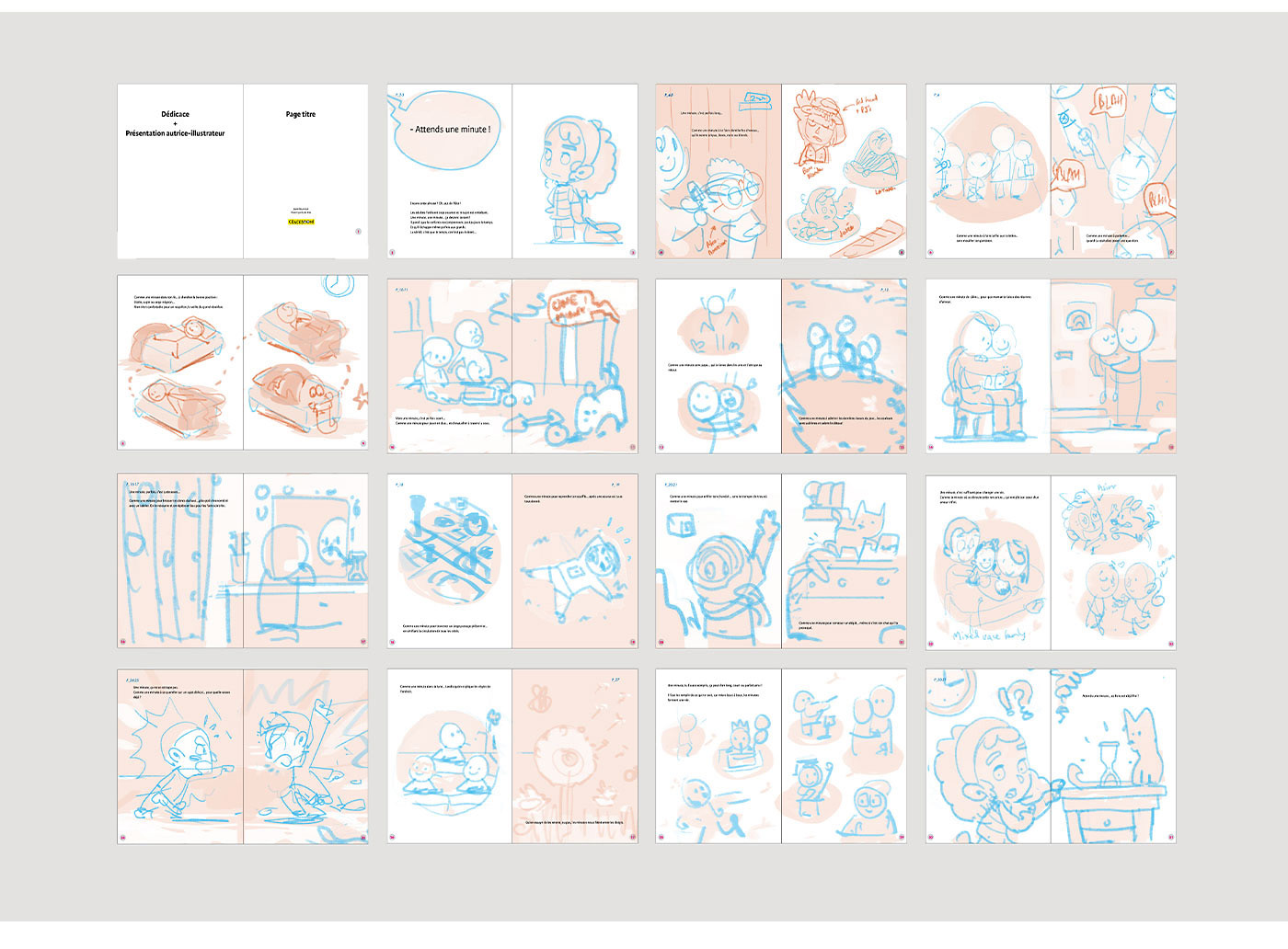
From this point onward, it’s a process of gradual refinement. I take each spread, enlarge it, and start working on character poses, environments, and details. Once all the spreads are at the same level, I submit a round of “detailed sketches” to my editor for approval.
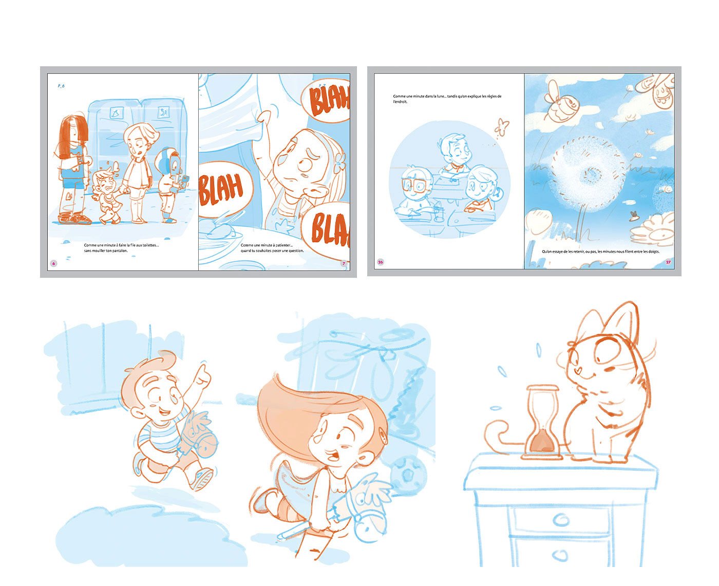
After the detailed sketches are approved, I do a final pass—cleaning up line art, finalizing poses, and resolving any remaining design issues. I continue to use value and color for communication throughout. Once the “clean drawings” are approved, I integrate them into the final files and begin the painting process.